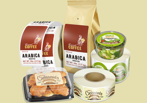
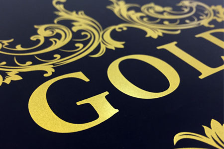
Labels design color is a factor that greatly influences the consumer’s vision and decision to buy certain products. The product is not only internal quality, but also has an impressive and harmonious design color. Thus, the new product is attractive and easy to keep in mind and reminds customers when to buy. In addition, color also plays an important role in communication, product promotion and brand identity.
The design color also has the ability to affect the customer’s emotions, psychology and taste. The product is remembered by customers for its external characteristics, it is considered a partial success. Just see or mention any color, customers can think of that product. For example: green soft drink – Pepsi, red canned soft drink – Coca Cola, green coffee brand – Starbuck, logo of blue electronics company – SamSung, …
Principles of using labels design color
Designers need to know some basics of color. Each design color will suit each time, the characteristics, the purpose and the intention of conveying the message of the product.
Hot colors help to attract attention, attracting eyes from a distance. Cool colors create a softer, more calm feel in the viewer.
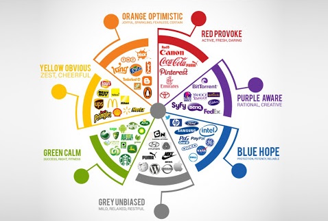
Red: enthusiasm, strength, energy;
Yellow: fresh, optimistic, and happy.
Orange: symbol of dynamism, passion and warmth;
Green: symbol of nature, prosperity
Blue: beliefs and health;
Black: mysterious, formal;
White: elegant, classy;
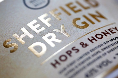
Each color will have a “land” shown. Our label should have an impressive and harmonious color scheme. Otherwise, our product will be rejected by the customer.
The importance of choosing the right print label design color
Many of you ask: How many colors do I use for my design? This is not the first question to answer. The first question to answer is “What color do I use to represent product characteristics?” And a series of questions posed after that to find the answer.
You need to understand the characteristics and timing of the product launch. Then choose the colors, mix them together to see if they are harmonious and suitable with the product. The design of the label color must reflect the spirit of the product.
Each product, object, or specific environment will use colors accordingly. For example, winter products use red, white, or blue; in summer, use fresh colors such as yellow, green leaves; the foods are rewarded with orange, red; for children, it is pink and blue; Elderly people are brown, purple; …
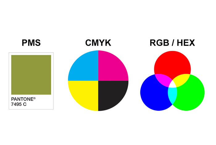
In addition, the choice of color also needs to be assured of accuracy from design to reality. To be sure, the actual colors represent the designer’s intentions.
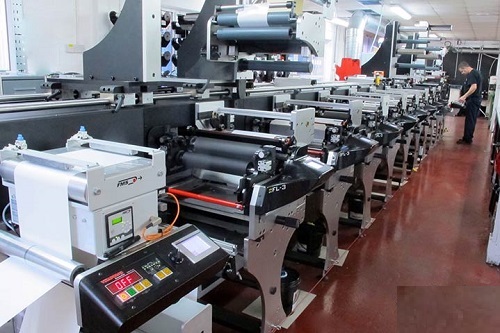
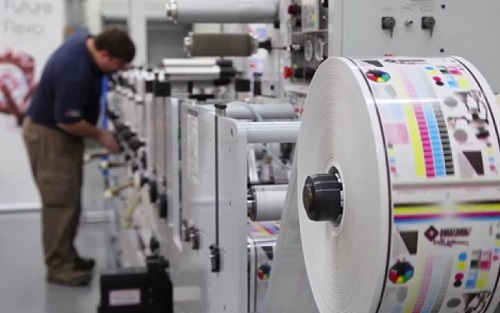
Please contact Hirich, we will fulfill all labeling requirements and pantone color capability is 95%.
References:
- Understanding colors for custom labels printing
- What is the difference between flexo and digital printing technology?
- Custom printed labels – Things to keep in note
- Five emotion – influencing design elements for your custom printed labels
- Direct Thermal vs. Thermal Transfer
- Labels printing material types