Consumers respond emotionally to specific design elements, which is important to consider when creating your next label. This is where neuromarketing comes into play; the study of how the subconscious brain responds emotionally to design stimuli. This helps us understand the underlying reasons as to why consumers make the purchasing decisions they do. In this blog we talk about five neuromarketing elements specifically related to how a label can impact a consumer’s brand preferences and purchasing decisions.
So, how do labels design affect user emotion?
A successful label requires a symphony of visual elements to work together for the “big picture”. Our brains store and recall shape, color, type, images and touch to arrive at an emotional response. When these elements add up to a cohesive design, a compelling label is created.
With over 15 years of experience, we share our top five considerations when creating an emotive label design along with label-specific examples of how different elements evoke different emotions.
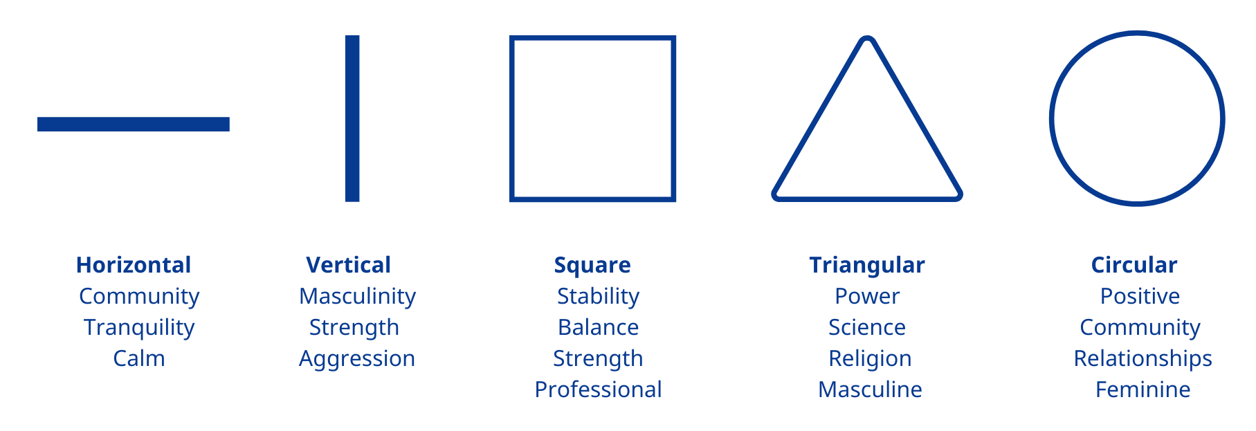
1. Shape
We respond in different ways to different shapes.
Straight lines, circle, curves and jagged edges all imply different meanings. Consider the shape of your pack or label dieline and how you could use shape to create a connection that reflects your brand identity. Create a bespoke label shape such as a two-part label, torn-look edges or a geometric shape can enhance and differentiate your product.
Label shapes can also be created through clever design within a standard shape, especially when using a clear material.
 2. Color
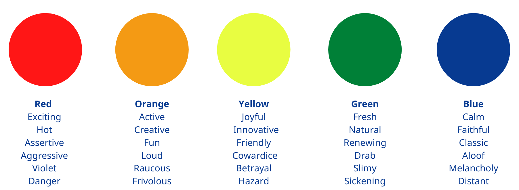
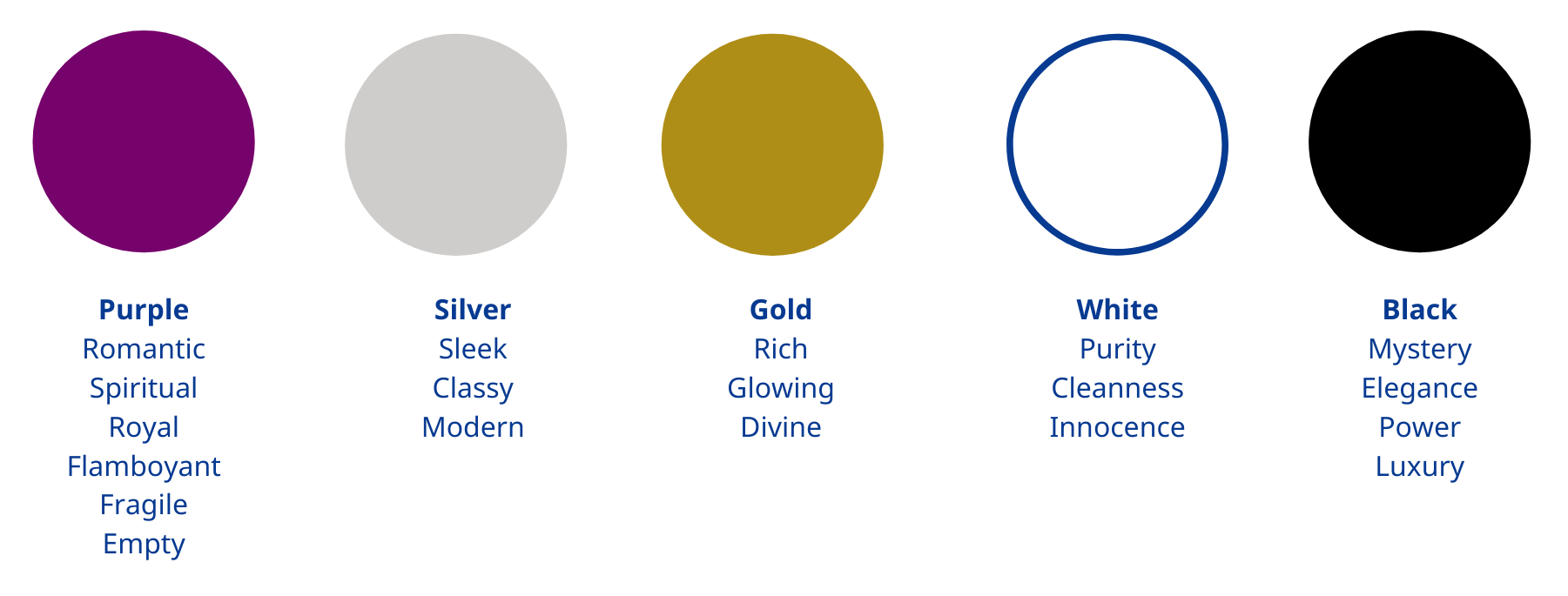
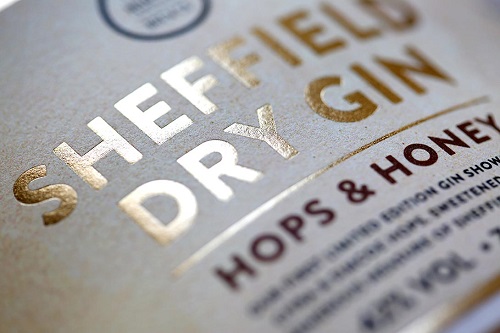
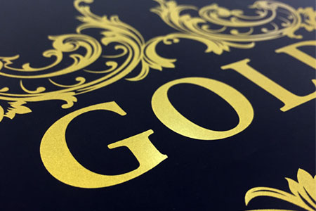
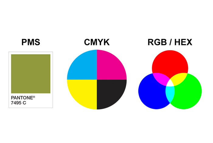
Color affects people both physically and psychologically and can also influence the perception of taste. Colors convey messages, create associations, and add brilliance to labels. Color also plays a key role in logos and highlighting specific design elements. Incorporating spot colors, foils or specialty inks (such as Luxury Gold, silk screens and metallic inks) are a great way to introduce impactful color.
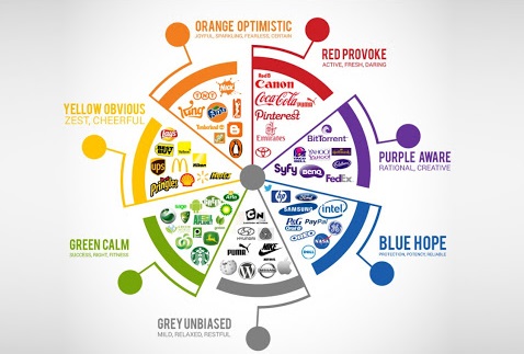
What do specific colors say? Here are some examples of emotions that key colors are associated.
 3.Typography
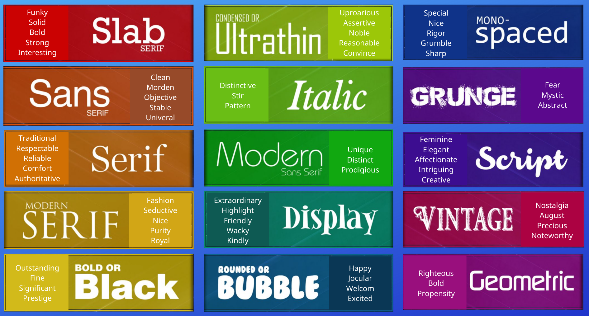
Typography plays a huge role in developing a strong design and making a first impression. Different categories of typefaces evoke different emotions, as do the individual characteristics of a specific typeface. Angular typefaces may appear as aggressive or dynamic, while soft rounded letters give a youthful, friendly appeal. Curved typefaces and cursive scripts are perceived as more feminine, while strong bold lettering has a more masculine edge. Also consider typography for reverse printing when designing your label for extra communication space to minimize clutter and add extra information.
The emotions associated with the key categories of typefaces are:
 4. Images
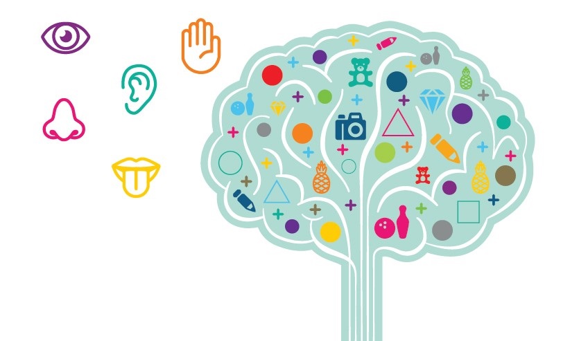
Images are processed 60,000 times faster than text, creating instant emotional connections. It has also been found that type is perceived as more credible when accompanied by imagery. Our printing technologies ensure that both photographic and illustrative imagery is replicated in sharp, clean and brilliant quality.
The emotions associated with photographic imagery are quite different to those associated with illustrations:
 5. Touch
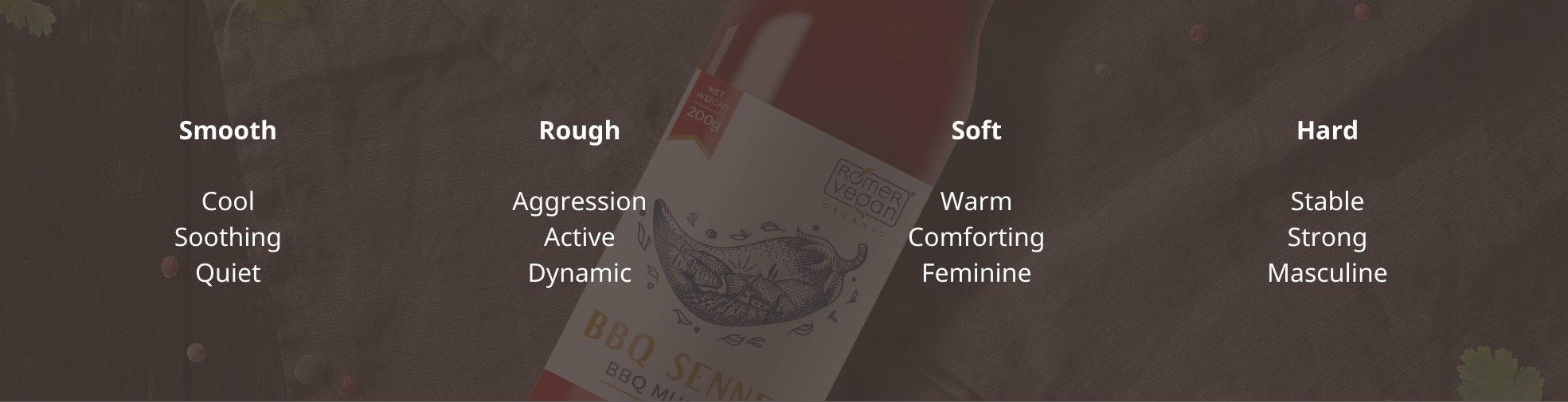
Touch is one of the most important senses in driving consumer behavior. People are more likely to buy a product if they are able to touch it first. However, the feel of the label itself may also be very effective in creating emotional reactions and connections. Incorporating embellishments it the perfect way to create a tactile experience. Using a sandpaper coating in your label design gives a unique, gritty, tactile finish. A soft touch coating or lamination does just that – create a luxuriously soft finish. A high build offers a raised, glossy appearance to highlight key design areas on the label or to create a textured pattern. It is very effective when used as a super gloss highlight over a matt-finish background. Alternatively, a contrasting combination of spot and matt coatings can create a very effective textured, 3D look. Another option to consider is using a textured or uncoated paper which give a premium and authentic look whilst providing a tactile experience.
These tactile options are associated with the following emotional responses:
 The options for incorporating these five emotion-influencing design elements into the different features of a label are endless. Our team would love to help you select the right options for your brand, whether it be shape, color, material, embellishments of finish.
Source: https://www.hallylabels.com/about/careers/
Refference:
- Understanding colors for custom labels printing
- Labels design color – Principles of use and importance
- Direct Thermal vs. Thermal Transfer
- Custom printed labels – Things to keep in note
- What is the difference between flexo and digital printing technology?
- The demand for printing digital packaging of small and medium enterprises increased