

Beautiful label design: where creativity meets manufacturing capability
A beautiful label on a drawing doesn’t necessarily look beautiful on the shelf. And a label that looks great on the shelf but cannot be produced within a reasonable budget holds no commercial value. Effective label design is one that masters both visual principles and the constraints of printing technology and materials.
Below are seven label design principles that help your products stand out on the shelf, while ensuring production feasibility and optimal cost efficiency.
7 Label Design Principles Aligned with Real-World Production
1. Clear visual hierarchy: Buyers only have 2-3 seconds to scan a product on the shelf. The brand name, product name, and key differentiator (USP) must be instantly readable in that moment. Everything else—ingredients, instructions, barcodes—is secondary information, which should be smaller in size and positioned lower in the visual hierarchy.
2. Typography for Readability, Not Just Aesthetics: In flexo printing, fonts with overly thin strokes (thin, light) or very small serifs can become clogged or broken when printed on ink-absorbent materials. Minimum font size should be 5–6pt for digital printing and 7–8pt for flexo. Medium-weight sans-serif fonts are generally the safer choice for mandatory information.
3. Color must account for the substrate material: The same Pantone color code printed on white paper, transparent film, and silver decal will yield three completely different results. When designing for transparent film, a white ink underlay is required to prevent color distortion. When designing for kraft paper, account for how the brown tone of the substrate will affect every color printed on top of it.
4. Whitespace is a weapon: Labels crammed with too much information lose points on the shelf. Strategic whitespace directs the buyer’s eye to what matters most and conveys a sense of premium quality. The rule: if there’s no compelling reason to keep an element on the label, remove it.
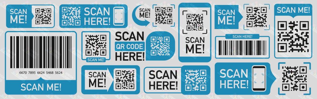
5. Barcodes and QR codes must be testable: Minimum barcode dimensions, quiet zones, contrast, and print orientation must be verified before production. A barcode that looks good graphically but cannot be scanned will cause severe damage to an entire shipment—especially when sold through modern retail channels.
6. Leverage surface finishing instead of adding graphic details: Embossing, debossing, spot UV, and hot stamping create premium effects without complicating your print file. While these techniques add to production costs, they deliver exceptional perceived value for premium products.
7. Design must be scalable across multiple sizes: The same design may need to be applied to 50ml, 100ml, and 200ml bottles. The design must be able to flex and scale without breaking the visual hierarchy or losing mandatory elements at the smallest size.
Verify production feasibility before approving the final design
A great label design must pass the production test before it gets approved. At Hirich, every design goes through a technical preflight review that evaluates color feasibility on the chosen material, text readability at actual size, and compatibility with the intended printing technology. This process ensures the final design not only looks great on the shelf but also delivers stable, budget-friendly production.
© Copyright by Hirich Labels.


